Catherine "Kate" Greenaway stands as one of the most influential and beloved figures in the history of British illustration and children's literature. Active during the latter half of the Victorian era, her distinctive artistic style captured a romanticized vision of childhood that resonated deeply with her contemporaries and continues to enchant audiences today. Born in London in 1846 and passing away there in 1901, Greenaway carved a unique niche for herself, creating a world filled with gracefully drawn children in quaint, historically inspired attire, set against idyllic, often sparse, pastoral backgrounds. Her work not only dominated the children's book market of her time but also significantly impacted fashion and decorative arts, leaving an indelible mark on the cultural landscape. Her legacy is cemented by the prestigious Kate Greenaway Medal, awarded annually for distinguished illustration in a children's book, ensuring her name remains synonymous with excellence in the field she helped to define.
Early Life and Artistic Formation
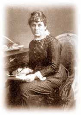
Kate Greenaway was born on March 17, 1846, in Hoxton, a district in the East End of London. Her background provided a fertile ground for her future artistic endeavours. Her father, John Greenaway, was a talented draughtsman and engraver, whose business, though often financially precarious, exposed young Kate to the world of printmaking and illustration from an early age. Her mother, Elizabeth Jones Greenaway, was a skilled seamstress who ran a successful dress shop, an influence that would later manifest in Kate's meticulous and stylish depiction of clothing in her illustrations.
A significant part of her childhood was spent not in the bustling city, but in the countryside village of Rolleston, Nottinghamshire, where she stayed with relatives. These formative years immersed her in the rhythms of rural life, the beauty of English gardens, and the charm of village architecture. This experience deeply informed her artistic sensibility, fostering a lifelong affection for nature and a somewhat nostalgic, idealized view of pastoral England that would become central to her work.
Recognizing her artistic talent, her family supported her pursuit of formal art education. Beginning at the age of twelve, Greenaway embarked on a rigorous training path. She initially attended the Finsbury School of Art, then moved to the South Kensington School of Art (now the Royal College of Art), followed by studies at the Heatherley School of Fine Art, and finally, the prestigious Slade School of Fine Art. This comprehensive education provided her with a strong foundation in drawing, design, and composition, though she often felt constrained by the academic emphasis on realism, already leaning towards the more stylized and decorative approach that would become her hallmark.
The Emergence of a Unique Style
During the 1860s and early 1870s, Kate Greenaway began her professional career, initially undertaking various commercial art commissions. She designed greeting cards, particularly for Valentine's Day and Christmas, for the publisher Marcus Ward & Co. She also contributed illustrations to various magazines, including Little Folks and the Illustrated London News. These early works allowed her to hone her skills and gradually develop the distinctive style that would bring her fame.
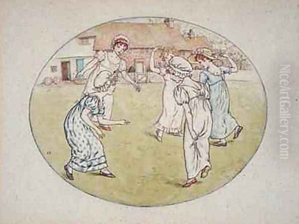
Her emerging aesthetic was characterized by a departure from the more robust and often caricatured depictions of children common in earlier Victorian illustration. Instead, Greenaway presented children, predominantly girls, as delicate, graceful figures embodying innocence and sweetness. They were often depicted in motion – walking, running, dancing, or playing games – lending a sense of gentle vitality to her scenes.
A key element of her unique style was the clothing worn by her figures. Rather than contemporary Victorian fashion, Greenaway dressed her children in attire inspired by late 18th-century and Regency period styles: high-waisted dresses, smocks, pinafores, large bonnets, mob caps, and skeleton suits for boys. This nostalgic costuming contributed significantly to the charming, old-world feel of her illustrations, evoking a sense of a simpler, more innocent past. This aesthetic resonated with the burgeoning Arts and Crafts and Aesthetic movements, which also looked to historical styles and emphasized beauty and craftsmanship over industrial modernity. Influences from artists associated with these movements, like William Morris, and the earlier Pre-Raphaelites, such as Dante Gabriel Rossetti and John Everett Millais, can be discerned in her emphasis on decorative pattern and idealized beauty, albeit translated into her own gentle idiom.
Collaboration with Edmund Evans and Breakthrough
The turning point in Kate Greenaway's career came through her collaboration with Edmund Evans (1826-1905), a master wood engraver and colour printer. Evans was a pivotal figure in the development of high-quality colour printing for children's books, utilizing a refined woodblock process known as chromoxylography. He was renowned for his ability to faithfully reproduce the subtle watercolour tones of artists, and he actively sought out talented illustrators whose work was suited to his methods.
Recognizing the unique appeal and commercial potential of Greenaway's delicate watercolours and charming verses, Evans took a professional risk. In 1879, he engraved and printed her collection of drawings and rhymes, Under the Window. Greenaway had initially offered the manuscript to her regular publishers, but they declined. Evans, however, saw its promise and agreed to publish it himself through George Routledge & Sons.
Under the Window was an unprecedented success. The initial print run of 20,000 copies sold out quickly, and it eventually sold over 100,000 copies in English, with further editions translated into French and German. The book's combination of Greenaway's enchanting illustrations, simple verses, and Evans's high-quality colour printing captivated the public. It established Kate Greenaway as a household name and marked the beginning of a highly fruitful partnership with Evans, who would go on to print most of her subsequent major works, as well as those of her celebrated contemporaries, Walter Crane and Randolph Caldecott. These three illustrators are often considered the triumvirate of the "Golden Age" of children's book illustration in Britain, largely thanks to Evans's technical skill and artistic vision.
Major Works and Themes
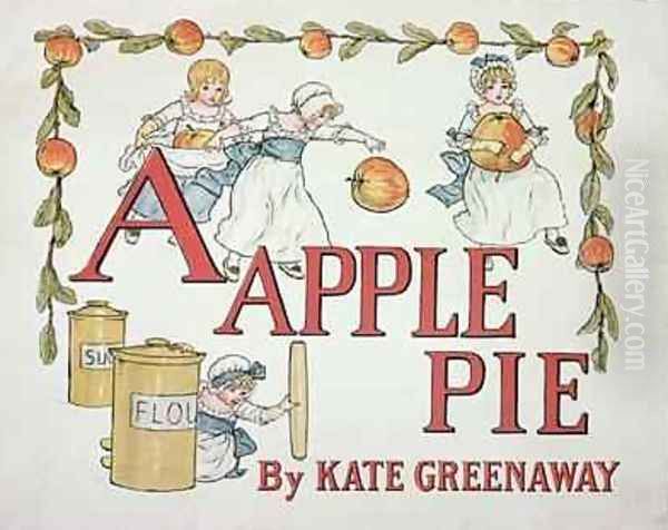
Following the triumph of Under the Window, Kate Greenaway produced a steady stream of popular books, solidifying her reputation. Among her most notable works are Kate Greenaway's Birthday Book for Children (1880), Mother Goose; or, The Old Nursery Rhymes (1881), A Day in a Child's Life (1881, with music by Myles B. Foster, not the watercolourist Myles Birket Foster), Little Ann and Other Poems by Ann and Jane Taylor (1883), The Language of Flowers (1884), Marigold Garden (1885), A Apple Pie (1886), and The Pied Piper of Hamelin by Robert Browning (1888).
A particularly popular series was her annual Almanack, published almost every year from 1883 to 1897 (with a gap in 1896). These small, pocket-sized books featured charming seasonal illustrations and verses, becoming highly collectible items. They showcased her ability to create miniature worlds filled with detail and atmosphere, perfectly suited to the intimate format.
Across her body of work, several recurring themes emerge. The most prominent is the celebration of childhood innocence. Her children exist in a protected, idealized world, largely free from the hardships and complexities of adult life or the grimmer realities of Victorian society. They inhabit quaint cottages, wander through blooming gardens, play gentle games, and engage in simple, everyday activities imbued with a sense of wonder.
Nature is another central theme. Flowers, gardens, meadows, and orchards form the backdrop for many of her illustrations. Her depiction of nature is not wild or untamed, but rather cultivated and harmonious, reflecting the Victorian fondness for gardens and the pastoral idyll. The Language of Flowers, in particular, combined her delicate floral illustrations with the popular Victorian sentimentality surrounding the symbolic meanings attributed to different blooms.
Her work often evokes a sense of nostalgia, a longing for a perceived simpler, more graceful past, reflected in the Regency-inspired clothing and the gentle, orderly world her characters inhabit. This resonated with a Victorian audience grappling with rapid industrialization and social change, offering a comforting visual escape.
Artistic Characteristics
Kate Greenaway's artistic style is instantly recognizable, defined by several key characteristics. Her line work is typically delicate, clear, and precise. She favoured outlines drawn with a fine pen, creating figures and forms with a distinct, almost graphic quality. This clarity was well-suited for reproduction via wood engraving.
Her use of colour is perhaps her most defining feature. Working primarily in watercolour, she employed a palette of soft, often muted tones – pale blues, pinks, greens, yellows, and creams. These colours contribute to the gentle, dreamlike atmosphere of her illustrations. Edmund Evans's printing process was crucial in capturing the subtlety and luminosity of her original watercolours.
Greenaway's compositions are often characterized by their simplicity and decorative quality. Figures are frequently placed against plain or minimally detailed backgrounds, focusing attention on the children and their attire. She often arranged figures in frieze-like processions or balanced groupings, emphasizing pattern and rhythm over spatial depth. This approach, sometimes criticized for lacking background detail, aligns with the decorative principles of the Aesthetic Movement and gives her work a distinct, stylized elegance.
The "Greenaway child" itself became an archetype: typically slender, poised, with rosy cheeks and a somewhat serious or contemplative expression. While charming, her figures are often less individualized and more representative of an idealized type of childhood beauty and grace.
She masterfully integrated text and image. In books like Under the Window and the Almanacks, her own verses or selected texts are carefully placed on the page, often surrounded by illustrative vignettes or borders, creating a harmonious interplay between the visual and the verbal elements. This holistic approach to book design was a hallmark of the period's best illustrators.
The "Greenaway" Look and Fashion Influence
One of Kate Greenaway's most significant impacts was on contemporary fashion, particularly children's wear. The distinctive style of dress featured in her illustrations – often referred to as the "Greenaway look" – captured the public imagination and became highly fashionable. Parents, particularly those aligned with the Aesthetic Movement who rejected mainstream Victorian fussiness, began dressing their children in smocks, pinafores, high-waisted dresses, and bonnets inspired by her drawings.
This trend was notably embraced by Liberty of London, the department store founded by Arthur Lasenby Liberty, which became synonymous with Aesthetic and Arts and Crafts styles. Liberty produced and sold children's clothing directly inspired by Greenaway's illustrations, further popularizing the look among the fashionable middle and upper classes. The "Greenaway" style offered an alternative to the more restrictive and heavily ornamented children's clothes typical of the mid-Victorian era, promoting instead a sense of comfort, simplicity, and artistic sensibility.
This influence extended beyond clothing. Her designs appeared on nursery wallpaper, tiles, pottery, and other decorative items, demonstrating the extent to which her aesthetic permeated popular culture. Kate Greenaway became not just an illustrator, but the creator of a distinct brand and visual identity associated with idealized childhood and artistic taste.
Relationship with John Ruskin
A significant, complex, and often debated aspect of Kate Greenaway's life was her relationship with the preeminent Victorian art critic, writer, and social thinker, John Ruskin (1819-1900). Ruskin, already an established and formidable figure in the art world, became an ardent admirer of Greenaway's work in the late 1870s. He saw in her illustrations a purity, innocence, and connection to natural beauty that he felt was lacking in much contemporary art.
Their relationship developed primarily through correspondence, although they did meet occasionally. Ruskin became a mentor figure, offering praise, encouragement, and detailed, often exacting, criticism of her drawings. He urged her to pursue more "serious" art, particularly figure drawing from life and more detailed studies of nature, sometimes expressing frustration with the limitations he perceived in her stylized approach.
While Ruskin's patronage undoubtedly enhanced Greenaway's prestige and provided intellectual companionship, it also appears to have been a source of considerable anxiety and constraint for her. His critiques could be harsh, and his demands sometimes conflicted with her own artistic inclinations and the commercial pressures of her career. Some biographers suggest that his influence may have inhibited her artistic development in certain respects, pushing her towards an academic rigour that was not entirely natural to her talent. Their intense, albeit largely epistolary, relationship remained significant until Ruskin's health declined severely in his later years. It highlights the complexities of patronage, criticism, and personal connection within the Victorian art world.
Contemporaries and the Golden Age of Illustration
Kate Greenaway worked during a vibrant period for illustration in Britain, often referred to as the "Golden Age." She was part of a talented generation of artists who benefited from advances in printing technology, particularly colour printing, and a growing market for illustrated books and periodicals.
Her most direct peers, often grouped with her due to their association with the printer Edmund Evans, were Walter Crane (1845-1915) and Randolph Caldecott (1846-1886). Crane was known for his bold, decorative style, heavily influenced by Japanese prints and socialist ideals, often creating elaborate designs for books like The Baby's Opera. Caldecott was celebrated for his lively, humorous, and dynamic illustrations, full of movement and character, particularly in his series of Picture Books. While all three artists depicted children and nursery themes, their styles were distinct: Greenaway's gentle and nostalgic, Crane's decorative and formal, and Caldecott's energetic and witty.
Other notable contemporaries in the broader field of illustration and art included Beatrix Potter (1866-1943), whose beloved animal stories like The Tale of Peter Rabbit emerged slightly later but shared a focus on charmingly rendered nature and childhood themes. Ernest H. Shepard (1879-1976), famous for illustrating A. A. Milne's Winnie-the-Pooh and Kenneth Grahame's The Wind in the Willows, continued the tradition of classic British children's illustration into the 20th century. Arthur Rackham (1867-1939) developed a distinctively different, more fantastical and often darker style, known for his intricate pen-and-ink work in fairy tales and fantasy literature.
Greenaway's aesthetic connections also link her to the Pre-Raphaelite Brotherhood (Dante Gabriel Rossetti, John Everett Millais, Edward Burne-Jones) through their shared interest in medievalism, detailed observation (though applied differently), and idealized beauty. The Arts and Crafts Movement, spearheaded by figures like William Morris, shared her emphasis on craftsmanship and integrated design. Even the more decadent wing of the Aesthetic Movement, represented by Aubrey Beardsley (1872-1898), shared a focus on line and decorative effect, though his subject matter and style were vastly different. Watercolourists like Helen Allingham (1848-1926) and Myles Birket Foster (1825-1899) explored similar themes of idyllic English cottages and countryside, though often with a greater degree of realism. Greenaway navigated this rich artistic landscape, creating a unique and enduring contribution.
Fame, Commerce, and Challenges
Kate Greenaway achieved a level of fame and commercial success rare for a female artist in the Victorian era. Her name became a brand, instantly recognizable and highly marketable. Her books sold in vast quantities, not only in Britain but also internationally, particularly in America and Germany. The "Greenaway" style permeated nurseries and homes through books, prints, wallpaper, fabrics, china, and greeting cards.
This immense popularity, however, brought challenges. Her distinctive style was widely imitated, often poorly, by other artists and commercial manufacturers seeking to capitalize on her success. Pirated editions of her works appeared, particularly abroad. Publishers sometimes used her name prominently on books to which she had contributed only minimally, or even not at all, blurring the lines of authorship and potentially diluting her artistic reputation.
While financially successful for much of her career, Greenaway was known to be meticulous and relatively slow in her production, sometimes struggling to meet the demands of her publishers and the public. She was also sensitive to criticism and deeply affected by the pressures of maintaining her popularity in a competitive market. The very success that defined her career also created significant personal and professional pressures.
Later Life and Artistic Ambitions
In her later years, Kate Greenaway sought recognition beyond the realm of children's book illustration. She harboured ambitions to be accepted as a "serious" artist in the academic sense, perhaps influenced by Ruskin's urgings. She devoted more time to watercolour painting, particularly studies of flowers and portraits, and also experimented with oil painting.
She exhibited works regularly at the Royal Academy of Arts and other galleries, including the Royal Institute of Painters in Water Colours, of which she became a member in 1889. While her exhibition pieces were generally well-received, they never achieved the widespread acclaim or cultural impact of her illustrations. Her attempts to shift towards more academic or naturalistic styles were perhaps less suited to her innate talents, which lay in decorative design and the creation of charming, stylized worlds.
By the late 1890s, public taste began to shift, and the phenomenal popularity of the "Greenaway" style started to wane slightly. New illustrators with different approaches were emerging. Coupled with this, Greenaway began to suffer from ill health. She was diagnosed with breast cancer, which eventually metastasized. Despite her illness, she continued to work when possible, driven by both artistic commitment and financial necessity.
Death and Enduring Legacy
Kate Greenaway died at her home in Hampstead, London, on November 6, 1901, at the age of 55. Her death was widely mourned, recognized as the passing of a major cultural figure. She was buried in Hampstead Cemetery.
Her legacy proved to be profound and lasting. Kate Greenaway fundamentally changed the landscape of children's literature and illustration. She brought a new level of artistry, sensitivity, and aesthetic refinement to the field, demonstrating that books for children could be objects of beauty. Her idealized vision of childhood, though perhaps sentimental by modern standards, captured a powerful archetype of innocence and grace that continues to hold nostalgic appeal.
Her influence on fashion, particularly the move towards simpler, more artistic clothing for children, was significant. Her work remains a key example of the Aesthetic Movement's impact on popular culture. Furthermore, her success paved the way for subsequent generations of female illustrators.
The most tangible testament to her enduring importance is the Kate Greenaway Medal. Established by the Library Association (now CILIP: Chartered Institute of Library and Information Professionals) in 1955, it is awarded annually to an outstanding work of illustration in a children's book published in the UK. It stands alongside the Carnegie Medal for writing as the country's most prestigious children's book award, ensuring that Kate Greenaway's name remains associated with the highest standards of artistic achievement in the field she so brilliantly illuminated. Her delicate drawings continue to be reproduced and cherished, offering a timeless window onto a gentle, imagined world of perpetual spring and childhood innocence.
Conclusion
Kate Greenaway remains a pivotal figure in art history, celebrated for her unique contribution to illustration, children's literature, and Victorian visual culture. Her charming depictions of children in Regency-inspired dress, set within idyllic English landscapes, created an instantly recognizable and immensely popular aesthetic. Through her collaboration with Edmund Evans and the success of works like Under the Window, she achieved international fame, influencing fashion and decorative arts. While navigating the complexities of her relationship with John Ruskin and the challenges of commercial success and imitation, she maintained a distinctive artistic vision. Her legacy endures not only through her beloved books and the prestigious medal named in her honour but also in the lasting image she crafted of childhood innocence—a gentle, beautiful, and enduringly appealing world that continues to captivate and inspire.